[This essay is based on a paper that was delivered to members of The Trollope Society on 9th November 2015 at The House of Illustration, London.]
he collaboration between Anthony Trollope and John Everett Millais was one of the most sustained working partnerships of the nineteenth century, and only bears comparison with the long-standing arrangement between Charles Dickens and H.K. Browne (Phiz), Lewis Carroll and John Tenniel, and W. H. Ainsworth and George Cruikshank. The qualities of Millais’s illustrations and the ways in which they enrich our understanding of Trollope’s text have been well established by critics such as N. John Hall and Paul Goldman. However, the relationship between Trollope and Millais was a fairly unusual one. In the mid-Victorian period it was more characteristically the case that authors were illustrated by several rather than a single illustrator. The economic demands of rapid publication in serial form meant that writers were allotted artists by their publishers; sometimes the match was a good one – as happened in George Smith’s partnering of Trollope and Millais – and sometimes it was more arbitrary, driven forward by supply and demand, availability and the need to contain production costs.
This was very much the situation in the case of Trollope’s ‘other’ illustrators, who filled the space when Millais was not available. Trollope wanted Millais to continue his work with him, but Millais’s developing career as a painter occupied most of his time; he had only taken to illustration to bolster his earnings, and the saleability of his paintings meant that working for the page lost its appeal. This is essentially a loss, and modern critics have stressed what they see as a decline in the quality of Trollope’s visual interpretations. Hall is particularly sharp in his condemnation, describing some of Trollope’s other artists, notably Frank Holl and William Small, as the authors of ‘execrable’ work (pp. 143–4); other critics have used similar terms.
One main complaint involves the artistic quality of many of the author’s post-Millaisian illustrators. Unlike Millais, whose skills as a designer were considerable, some of Trollope’s other collaborators were poor draughtsmen. Surpringingly, given the extraordinary range of talent available at the time Trollope published his novels, some of them were illustrated by some of the worst practitioners in the field, with two of his illustrators not even being professionals. The weakest illustrations are those produced by the hobbyist Lionel Fawkes for The Way we Live Now, which appeared in monthly numbers in 1874–75. Fawkes’s drawings are stilted pieces of gaucherie, as in the illustration Get to your Room. The facial expressions and organization of the figures and the space they occupy are amateurishly handled, and it is unclear why the publishers Chapman and Hall selected this artist when they could have chosen from the more able. Trollope had no involvement in the images’ production and his response to the illustrations was one of despair and disgust; ‘what can a writer do?’ (qtd. Hall, p. 145) he laments in a letter to a friend. The end result was unproductive, with what is arguably his greatest novel being visualized by his weakest interpreter.

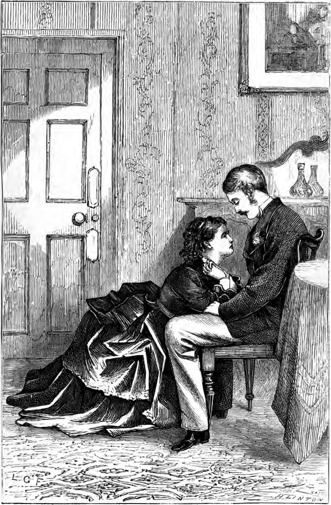
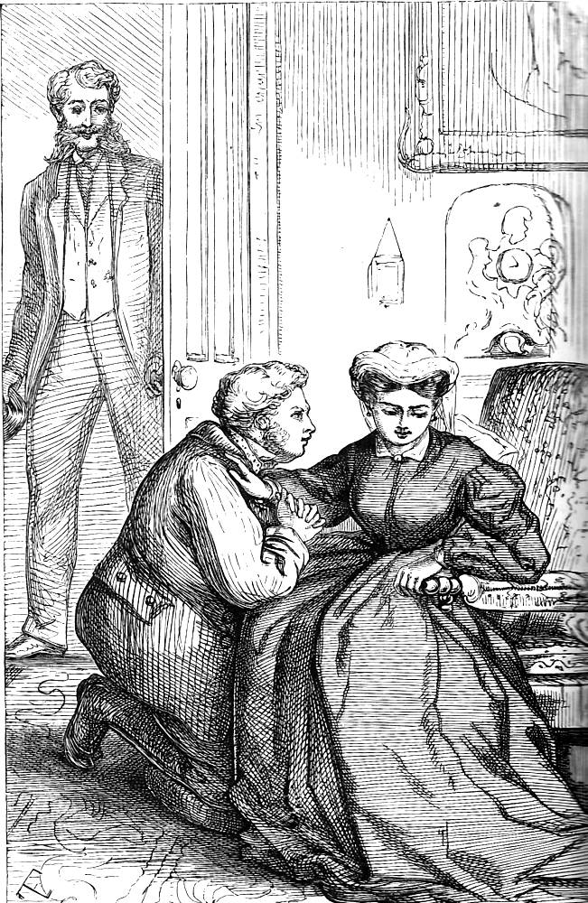
Left: Go to Your Room by Fawkes. Middle: “I have come across the Atlantic to see you” by Fawkes. Right: Mr Cheesacre disturbed by Taylor. [Click on images to enlarge them.]
He was better served, if only marginally, by the illustrations for the second half of Can you Forgive Her? of 1864-65. The artist here was another amateur, a Ms. E. Taylor – of whom very little is known but who was chosen, apparently, on Trollope’s urging. Taylor’s designs are uneven; some are well drawn in the manner of the realism of the 1860s while others show a poor understanding of figure drawing and space. A typical example is Mr Cheeseacre Disturbed, which characteristically displays the artist’s uncertain perception of perspective and space; the door is uneasily foreshortened and the picture-plane tips towards us. Other illustrations are more successful, but the overall effect is dream-like rather than realistic.
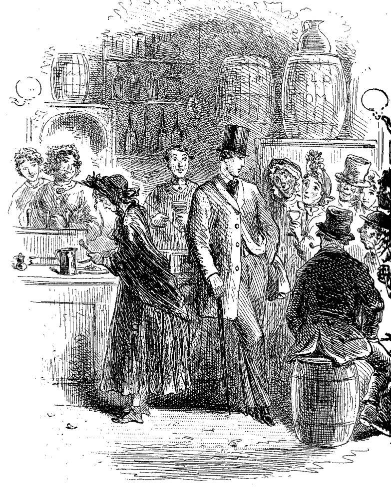
Burgo Fitzgerald by Phiz.
These formal considerations are important given the emphasis on the aesthetics of verisimilitude, but there are other occasions when the problem is not the drawing but a fundamental mismatch between the writer’s world-view and the artist’s. This was the difficulty with Phiz’s (HK Browne’s) illustrations for the first half of Can you Forgive Her? Phiz’s representation of Burgo Fitzgerald is a case in point. This is how Trollope describes him: “He was as handsome as ever – a man whom neither man nor woman could help regarding as a thing beautiful to behold – but not the less was there was in his eyes and cheeks a look of haggard dissipation – of riotous living which had become wearisome” (p.225).
However, viewed in terms of the dominant aesthetic of the time, Phiz’s design is not an accurate response; it does not mirror the text in the manner prescribed (and expected) by the author, embodying his character in an unfamiliar way which misses the implications of Trollope’s description. Burgo is indeed a ‘thing beautiful’, a sort of androgynous cad, and Phiz catches his arrogance in the swaggering gait; but there is no sense of psychological complexity, even bearing in mind the tiny scale, drawing his designs onto steel-plate, on which the artist is working. Lacking the depth normally associated with mid-Victorian illustration, Phiz’s Burgo is a visual formula, a type he used interchangeably in many of his other commissions, and the image, with its combination of caricature and idealization, is a poor match with Trollope’s writing. It belongs with Dickens and the grotesques of Lever and Le Fanu, but not with the writer of psychological and everyday realism of Can you Forgive Her? Trollope complained that Phiz ‘will take no pains to ascertain the thing to be illustrated’ (qtd. Hall, p.96), and the artist was summarily dismissed for (alleged) incompetence at the end of volume one.
Post or non-Millaisian illustration to Trollope might thus be described as of variable quality. Nevertheless, there are several illustrative series of greater value and, though neglected, repay attention. Trollope had three effective collaborators apart from Millais: Mary Ellen Edwards (The Claverings); George Housman Thomas (The Last Chronicle of Barset); and Marcus Stone, the illustrator of (He Knew He was Right. Each of these designers provides efficient illustrations which mediate between literal replication and imaginative interpretation.
Mary Ellen Edwards
Of special interest is Mary Ellen Edwards’s work for The Claverings, which was serialized in The Cornhill Magazine in 1866–67. Though neglected, Edwards was a prolific and inventive artist who contributed to a wide variety of gift books and periodicals. Unusually for a woman, she competed on equal terms with her masculine competitors in the world of wood-block illustration and was never short of a job, combining her professional life with her roles as a wife and mother. Edwards was probably linked with Trollope by George Smith, and as in his setting up of the partnership of Trollope and Millais Smith recognized the compatibility of the artist’s and writer’s interests. Though they never collaborated on a one-to-one basis, and probably never consulted directly, Edwards’s illustrations respond to the text while extending its implications.
Because Edwards combines an intense interest in social observation with an ability to visualize states of mind, her illustrations successfully interpret Trollope’s fiction. Her interest in psychology is particularly appropriate as she usually focuses on women: this was a great asset, allowing her to explore the state of mind of the anti-heroine, Julia. Julia marries Lord Ongar purely for money. As Trollope explains in his Autobiography: “The chief character is that of a young woman who has married so manifestly for money and rank that she does not pretend, even while she is making the marriage, that she has any other reason … Then comes the punishment” (II, 2). This outline is Edwards’s brief. In the opening design, she focuses on the cold-hearted bride in A Puir Feckless Thing. This represents Julia going into marriage with ‘no ecstatic joy’ or ‘rejoicing’ (Cornhill, 13: 152) her expression is disdainful, turned away from her husband-to-be, and the shading of her face suggests an underlying dismay. There is no love at work here, and Edwards subtly suggests the sexual nature of the transaction. Lord Ongar, a decrepit, worn out debauchee, looks on with open delight at this delicious bride: though never spelled out, Trollope has portrayed a case of sex paying for rank, and Edwards draws a sharp contrast between the radiance of Julia’s beauty and her partner’s leer.
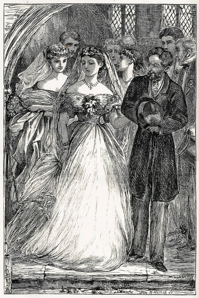

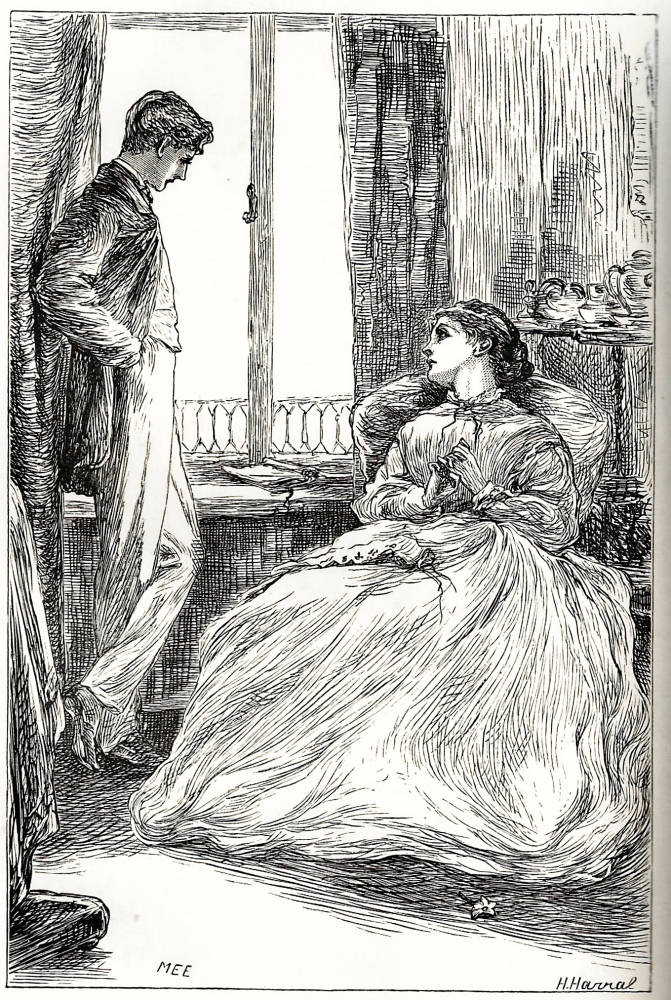
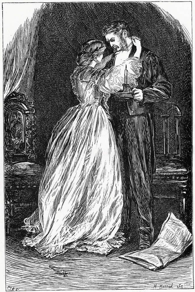
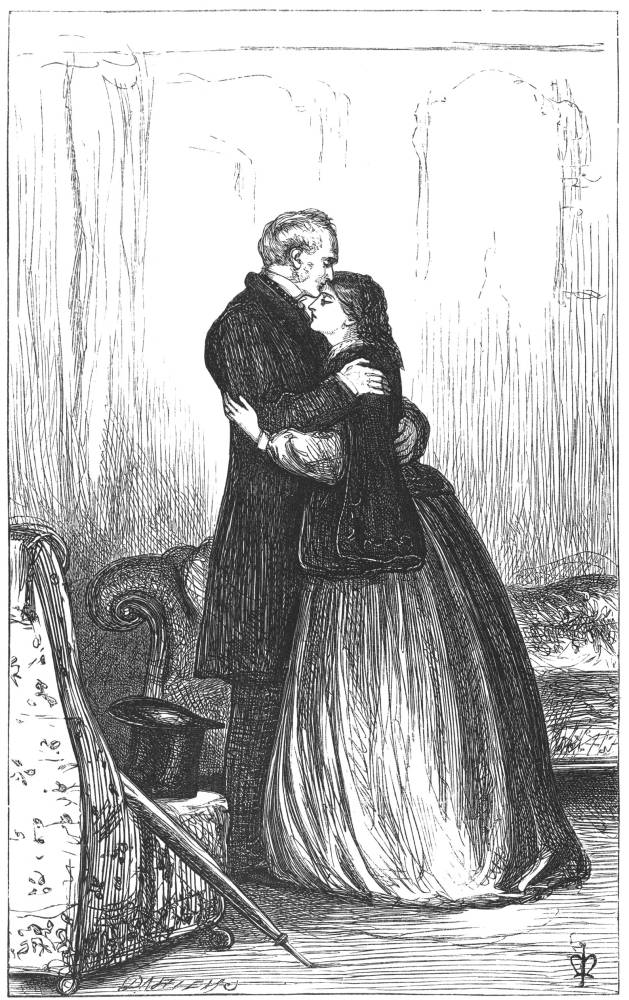
Four illustrations by Edwards compared to one by Millais (at right). Left: A puir feckless thing. Middle left: Illustrated initial letter. Middle: Harry’, she said, ‘There is nothing wrong between you and Florence?’. Middle right: Husband and Wife. Right: Millais’s Farewell. [Click on images to enlarge them.]
In Edwards’s treatment Julia is initially poised, as she is in the text, between coldness and despair. However, the focus of the illustrations changes as the series unfolds. Trollope explores aspects of Julia’s emotional collapse, but this becomes the heart of the illustrator’s reading. As a woman herself, Edwards presents Julia from a female perspective, depicting her as a character trapped by the circumstances of her gender and class. She is especially adept at suggesting the correlation between physical and psychological entrapment; following her husband’s death when she find herself in love with Harry Clavering, a man she cannot have, she is shown as a figure withdrawn into the confines of her rooms. Ultimately the stiff ribs of her crinoline, like her physical confinement, become a metaphor for her melancholy isolation.
In several of the illustrations we have a deeply resonant showing of Julia’s psychological condition. Edwards is especially powerful in her depiction of Julia’s emotional development as she realizes that she has to accept her situation. In one of the designs she embraces Florence Burton in acknowledgement of the fact that she will have to relinquish her love for Harry. This image takes us back into Millaisian territory, and it is interesting to compare it with Millais’s Farewell in Orley Farm. Edwards’s understanding of the characters’ emotions is further conveyed in her showing of Husband and Wife. This image depicts the unreciprocated feeling between Hugh and Hermione. Hermione is practically strangling her husband; the turbulent lines of her dress suggest inner turmoil, while he looks on impatiently. Edwards might be described, in short, as an illustrator who promotes a psychological or emotional reading of Trollope’s text, adding nuances and emphases of her own. Different perspectives are offered by George Thomas and Marcus Stone.
The Illustrations of George Thomas
George Thomas was another jobbing illustrator of the period who interpreted a wide variety of texts in books and periodicals and is best known for illustrating Wilkie Collins’s Armadale in The Cornhill Magazine (1864–6). He illustrated just one of Trollope’s novels, The Last Chronicle of Barset, which was serialized between December 1866 and July 1867. The prospect of his doing any further illustrations was cut short by his untimely death in 1868, as the result of falling from a horse.
Thomas was only chosen to illustrate the book when Millais declined to undertake any further work. The collaboration was set up, once again, by George Smith of Smith Elder, and the unspoken assumption was that Thomas would do his best to emulate Millais’s work. This he certainly did in his representation of the characters: he studied Millais’s representations as they appeared in the other novels and did his best to create a continuity with visual types which were already in existence. It is interesting, for example, to compare Millais’s treatment of the Rev Crawley, from Framley Parsonage, with Thomas’s.
Forrest Reid calls this work ‘conscientious’ (p.248) if uninspired, but this is to underestimate the quality of Thomas’s work. His principle contribution, it seems to me, is the way in which he develops the characters. It is not easy for any artist to adopt someone else’s material, but Thomas takes Millais’s types and shows them, as is only appropriate, at a different stage in their stories.
The story is mainly concerned with Josiah’s Crawley’s crisis, accused of purloining a cheque for £20, and Thomas changes our perception of the poverty-stricken reverend by representing his anguish. Mr and Mrs Crawley, the first illustration in volume one, is a telling image: the face is more cadaverous than in Millais's representation and Thomas exploits small nuances of gesture; one hand clutches the knee while the other, with the fingers apart, suggests confusion and indecision. This is taken up in two later images, one showing him as a ruined man and one when he has been exonerated. Starting from the single illustration of Crawley in Framley Parsonage, Thomas maps the character’s turbulent story, and greatly adds to our sense of the reverend’s suffering.
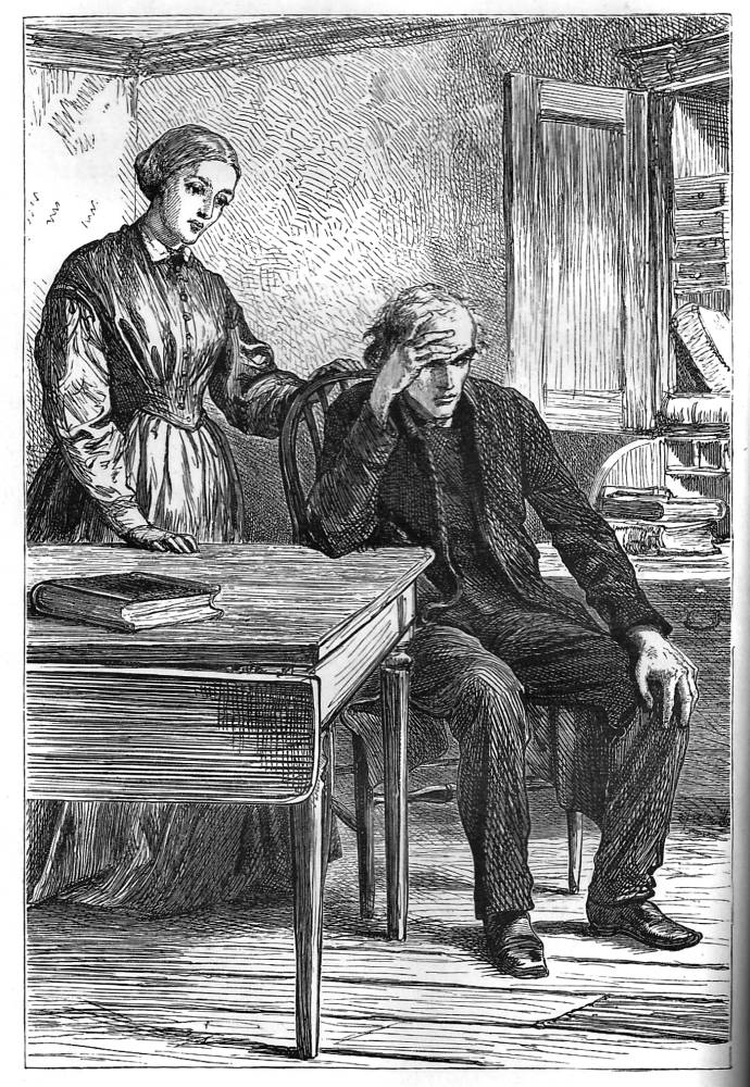
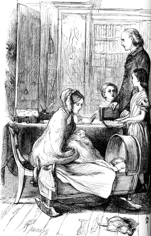
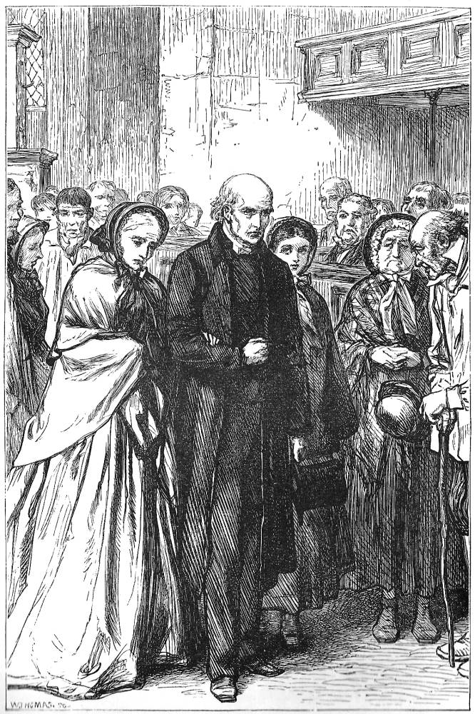
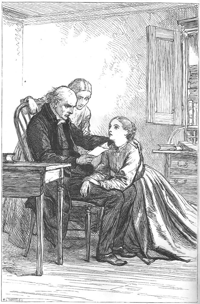
Three plates by Thomas and one by Millais. Left: Mr and Mrs Crawley. Middle right: The Crawley Family by Millais. Middle left: ‘They will come to hear a ruined man’. Right: Peradventure he signifies his consent. [Click on images to enlarge them.]
Thomas also adds other interpretive touches in the visual creation of new characters. Perhaps the best is Mrs Proudie, carried forward from Barchester Towers of 1857. This is a pivotal moment when Mrs Proudie berates the bishop with her opinion on the Crawley issue: a domestic tyrant, she dominates her compliant and intimidated husband.
‘A downright robbery of twenty just as though he had broken into the bank! And so he did, with sly artifice, which is worse in some hands than a crowbar. And now what are we to do?’ [ … ] Mrs Proudie was ready for the battle, and was even now sniffing blood far off. ‘I believe it’s a hundred and thirty pounds a year,’ she said, before the bishop had collected his thoughts sufficiently for an answer. [Last Chronicle, 1:89]
And this is how Thomas shows the event, creating visual equivalents to Trollope’s text. The facial expressions and gestures of the bishop and his wife tell us a great deal about the nature of their relationship: she is imperious, looking down at him, while the poor bishop has withdrawn into his chair, anxiously holding his hands in front of him.
Thomas thus continues and enhances the visual narrative that accompanies Trollope’s novels. Millais may not have been the illustrator for The Last Chronicle, but Thomas gives us vivid characterization which carries the story forward.
The Illustrations of Marcus Stone
Best known for his visual interpretation of Dickens’s Our Mutual Friend (1865), Marcus Stone illustrated Trollope’s He Knew He Was Right (1869). Hall regards Stone as the best illustrator after Millais (pp. 125–25), and there is no doubt that his work continues the work done by Trollope’s earlier collaborator. Each scene is efficiently visualized, and Stone focuses on the small nuances of behaviour and manners which are central to this and all of Trollope’s novels. Stone has two particular strengths, which again represent the artist’s personal interpretation: one is his capacity to suggest character and the other is his emphasis on the use of perspective and space.
Stone’s evocation of the characters’ psychological depths is well noted by Hall and is also the subject of criticism by Henry James. This is what James says of the scene where Trevelyan, separated from his wife, is contemplating what next to do:
I have always remembered the chapter called ‘Casalunga’ … as a powerful picture of the insanity of stiff-neckedness. Louis Trevelyn, separated from his wife, alone, haggard, suspicious, unshaven, undressed … and returning doggedly to his fancied wrong, which he has nursed until it becomes an hallucination, is a picture worthy of Balzac [qtd. Hall, p. 123].
James astutely identifies the character’s anxious rumination and Stone follows clear directions in the author’s text:
There was nothing attractive in the spot, but he was weary, and sat himself down on the dry hard bank … He sat watching the dragon-flies as they made their short flights in the warm air, and told himself that there was not one to whom less power of disquieting itself in God’s sun than to him. Surely it would be better for him that he should die, than live as he was now living without any of the joys of life. [He Knew He was Right, Vol 2: p.268].
The accompanying illustration, Trevelyan at Casalunga, provides a detailed representation of the grinding process of worry; the modern dress is recreated, but the artist shows the character as an ancient Man of Sorrows, a domestic Christ in a marital wilderness with nothing to do but reproach himself. Stone is especially adept at manipulating the setting: he registers the Pathetic Fallacy of Trollope’s description, and makes the surrounding landscape an index of mind.
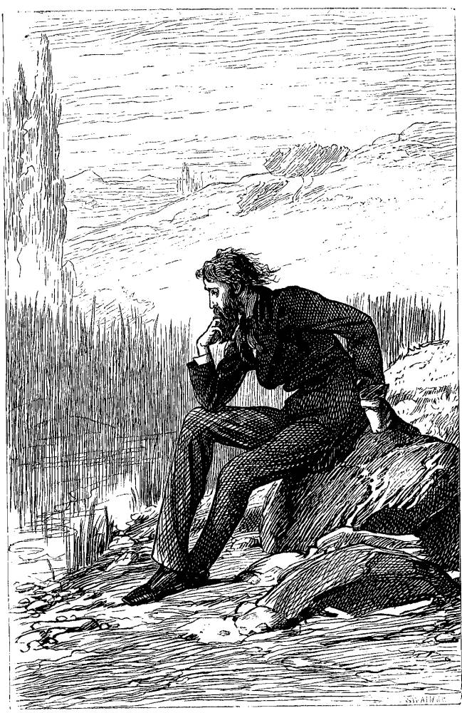
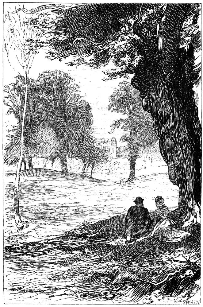
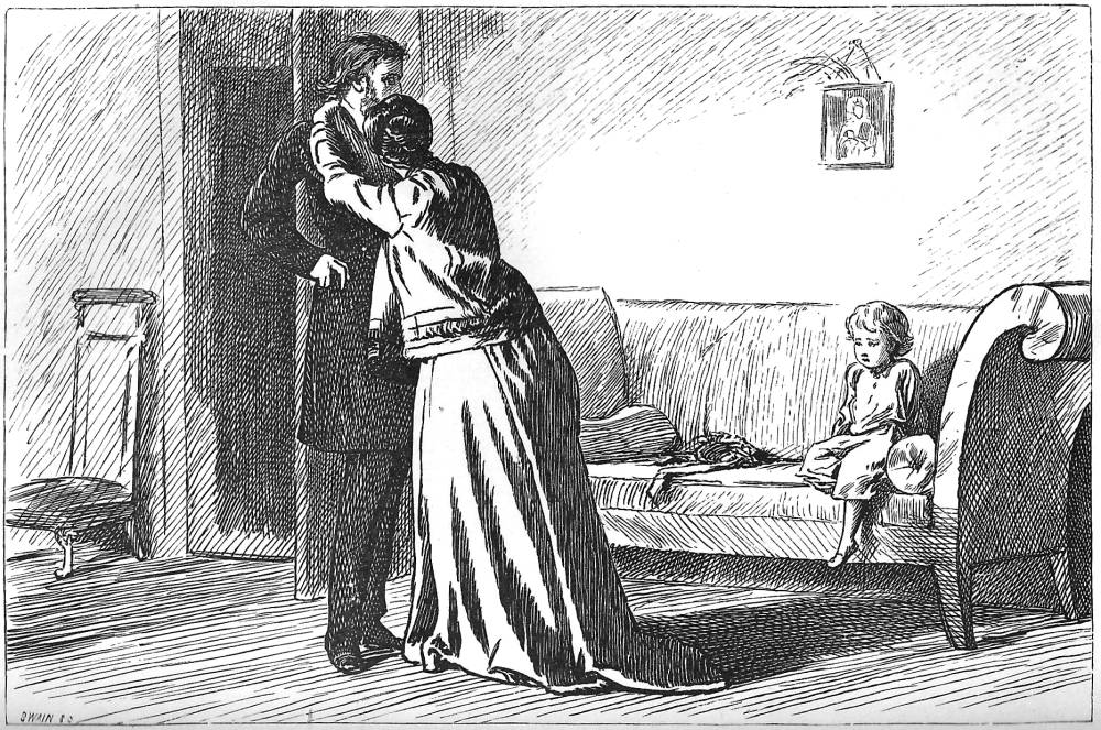

Three plates (at left) by Marcus Stone and one by Taylor. Left: Trevelyan at Casalunga. Middle left: Monkhams. Middle right: It is hard to speak sometimes. Right: Mr Cheesacre disturbed. [Click on images to enlarge them.]
Stone’s capacity to match the setting to the mood is further developed in his treatment of Monkhams. His representation of exteriors gives the novel as sense of the wider world that lies outside the intense exchanges of the drawing-room and in this design there is a direct correlation between the characters’ optimistic state of mind and the pastoral idealism of the estate. However, Stone frequently uses space itself – contracting and expanding the figures’ changing state of mind in terms of a compositional aperture that opens and closes, as it were, at key moments. The artist repeatedly distorts the space of interiors, although his strategy is far from predictable.
His illustration It is hard to speak sometimes is a sophisticated example of his reading of Trollope’s brutal analysis of discord. The author reveals the situation that underlies the embrace in the paradoxical terms of hesitation and excess:
‘Louis, why do you do me such wrong? Why do you treat me with such cruelty?’ Then she threw her arms around his neck, and before he could repulse her – before he could reflect whether it would be well that he should repulse her or not – she had covered his brow and lips and cheeks with kisses. [He Knew He was Right, 2:229]
Stone suggests the male character’s uncertainty and restraint by showing him looking detachedly over his wife’s head, with his right hand awkwardly placed in his coat-pocket. But more revealing is the expressive emptiness of the room: the wall to the right of the composition is blank except for a small picture and behind the characters is an opened door, suggestive of an exit into a greater, perhaps more liberating space. The voids around the characters are deployed, in other words, to imply the emotional distance between them. Stone uses this technique to great effect in his response to Dickens’s Our Mutual Friend, and it works here to deepen the psychological resonance of Trollope’s text.
Conclusions
In these interlocked discussions I have suggested some of the ways in which Trollope’s illustrators followed the example of Millais while creating their responses. In each case, they provide their own interpretations – emphasising some elements of their texts, adding nuance and generally enriching and inflecting the experience of engaging with the writing. There is no over-arching schema to link the artists’ work: it appears to be patchy because it was produced extempore, the responses of artists who created images within the pressurized context of the book-trade of the period.
Works Cited
Hall, N. John. Trollope and His Illustrators. New York: St Martins Press, 1980.
Reid, Forrest. Illustrators of the Eighteen Sixties. 1928; rpt. New York: Dover, 1975.
Trollope, Anthony. An Autobiography.2 Vols. London: Blackwood, 1883.
Trollope, Anthony. Barchester Towers.3 Vols. London: Longman, Brown, Green, Longman and Roberts, 1857.
Trollope, Anthony. Can You Forgive Her? 2 Vols. London: Smith, Elder, 1867. Illustrated by H. K. Browne and E. Taylor.
Trollope, Anthony. The Claverings. The Cornhill Magazine 13–15 (1866–67). Illustrated by M. E. Edwards.
Trollope, Anthony. Framley Parsonage. The Cornhill Magazine1–3 (1860–61). Illustrated by J. E. Millais.
Trollope, Anthony. He Knew He was Right. 2 Vols. London: Strahan, 1869. Illustrated by Marcus Stone.
Trollope, Anthony. The Last Chronicle of Barset. 2 Vols. London: Smith, Elder, 1867. Illustrated by G. H. Thomas.
Trollope, Anthony. Orley Farm. 2 Vols. London: Chapman & Hall, 1862. Illustrated by J. E, Millais.
Trollope, Anthony. The Way We Live Now. 2 Vols. London: Chapman & Hall, 1875. Illustrated by Lionel Fawkes.
Last modified 19 January 2016