Introduction
Walter Crane’s juveniles set new standards in the production of books for children. Figured as coherent pieces of design in which the artist created the illustrations, the end-papers and the covers, they revitalized the genre. Crane’s insistence on controlling each part was an essential ingredient in making this improvement, but equally significant was the contribution made by the wood-engraver, Edmund Evans. Otherwise known for his engraving of Richard Doyle’s In Fairyland (1870), as well as a huge number of ‘yellowbacks’, Evans cut and printed Crane’s imagery, producing vividly coloured pages and bindings.
This winning formula become the artist’s and engraver’s trademark, but Evans, an entrepreneur with an eye for opportunities, was determined to extend the publications’ impact by enlisting the services of other designers. His idea was to expand the portfolio by finding practitioners of comparable skill to work in the conventions he and Crane had invented; Randolph Caldecott and Kate Greenaway fitted neatly into the groove, taking up, as Percy Muir remarks, where the older artist had ‘left off’ (166).
Caldecott and Greenaway produced highly-coloured picture-books which segue with Crane’s. Caldecott created his own versions of the Toy-Books, which were made up of several pages bound in a paper cover, and Greenaway worked in a variety of formats. Both artists, working hard to establish a reputation, were prolific. Caldecott issued two books a year between 1878 and 1885, a run only brought to an end by his untimely death in 1886; another seventeen complete his corpus of work, while Greenway went on to produce some dozens of books under Evans’s direction.
Published by either Frederick Warne or George Routledge, these artists continued and developed the Regency style that first appears in the work of Crane and also features in illustrations by Chris Hammond and Hugh Thomson. In keeping with this tradition, Caldecott and Greenaway visualize the past nostalgically, creating a version of Britain in which industrialization has yet to make its mark and England is an innocent, timeless idyll. Caldecott's vision is populated by elegant ladies, idealized landscapes, picturesque villages and robust bucolics, and Greenaway's by well-scrubbed children in Regency costumes, engaged in play or minor acts of disobedience. The effect in both cases is sentimental and – to some commentators at least – cloying. But Caldecott and Greenaway's intention was to create an alternative space, an fantasy world in which children’s imaginings could find expression while also, in very many cases, appealing to adults.
The illustrations were only part of the equation, however. Bound by Crane’s practice, Greenaway and Caldecott designed every aspect of their books, producing a series of unities between the outer and inner surfaces. Their publications’ interiors have been the subject of critical scrutiny, but it is less often noted that each artist created striking book covers.
Caldecott’s Book Design and Book Covers
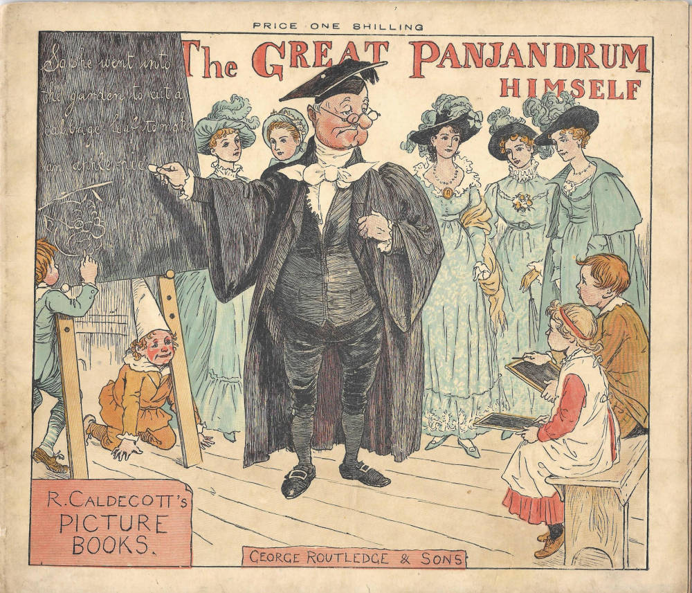
Caldecott’s ‘Picture Books’ project the interior in the form of coloured scenes which introduce the main characters and situations. This proleptic strategy is exemplified by The Great Panjandrum Himself (1885), which shows the eponymous hero at work in the classroom, and by the front cover of Ride a Cock-Horse to Banbury Cross (1884) featuring a dynamic design of an elegant lady on a prancing mare. Another approach is provided by Hey Diddle Diddle and Baby Bunting (1882), this time presenting a cat playing its violin; The Farmer’s Boy (1881), with its bucolic image of the shepherd surveying his flock an idealized landscape, is a quieter scene and typical of the artist’s treatment of the rural idyll. These cheerful, poster-like scenes are arresting compositions, clearly intended to catch a child’s eye; the bright colours against a yellow field are vivid and imposing, and the draughtsmanship is bold, economical, and strictly to the point.
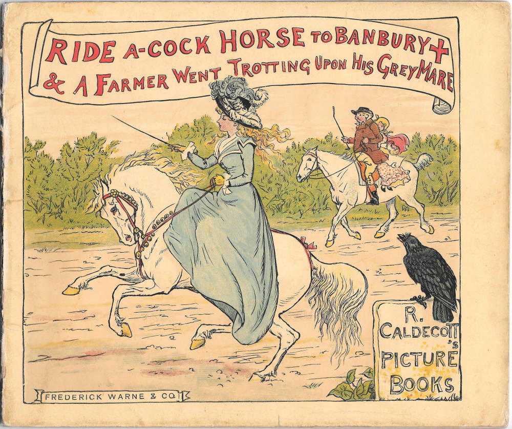
Caldecott also includes small motifs to generate interest and tease the juvenile reader: Hey Diddle Diddle contemplates the weirdness of a cat’s musicianship, The Farmer’s Boy has the artist’s monogram branded in red on the sheep, and Ride a Cock Horse has a large crow contemplating the fine lady who is decked as a rather finer bird than himself. We can imagine how a diligent parent might engage the reader’s interest by focusing on these elements, questioning the child, for example, as to the likelihood of a cat playing a fiddle and noting how boring a teacher the Great Panjandrum might be. Characterized by a desire to enter into the world of the childish imagination and be as entertaining as possible, Caldecott’s playfulness endows his covers with a refreshing directness and lead directly onto the contemplation of the words and images within.
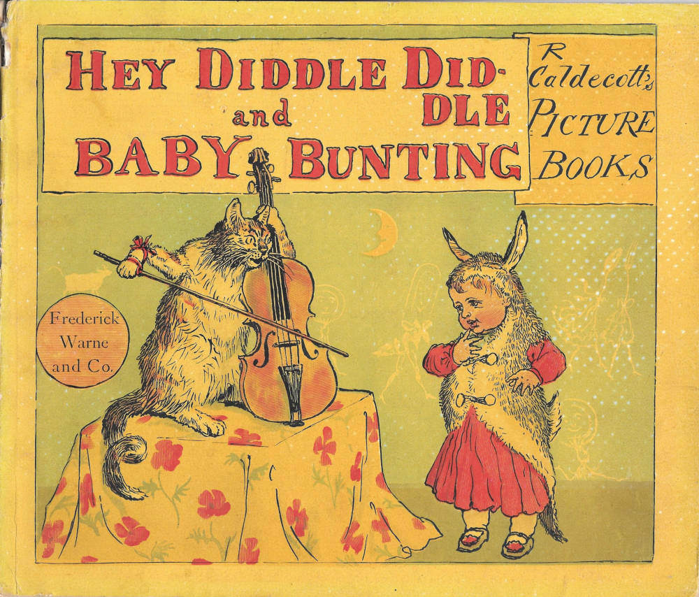
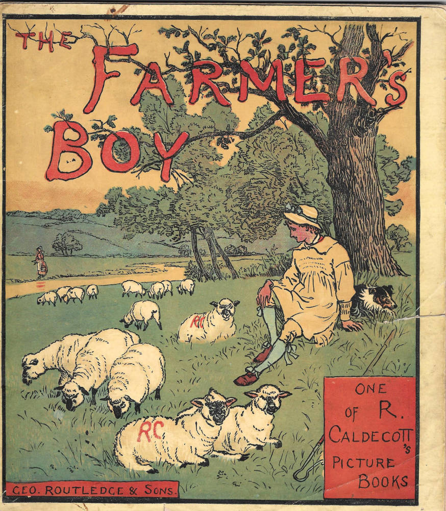
To modern eyes this arrangement seems obvious, but at the time of publication it was a novel approach. In previous books by Crane the binding established the tone and imagery of the interior; in Caldecott’s, by contrast, the cover is essentially an external page, an illustration indistinguishable from the illustrations contained within the book and only differentiated from the others by the inclusion of lettering. In reading these books, we start to read at the front cover and proceed directly to the pages within.
Caldecott’s treatment was only made possible, however, by Evans’s development of a new mode of production. Instead of printing the cover on card, as in the case of Crane’s toy-books, Caldecott’s bindings are mounted on the same thick paper (to avoid the ‘show-through’ of the colours) as the pages, with the whole publication sewn together as a quire of 24 leaves. Essentially, his books are pamphlets in landscape format; the covers would have been printed at the same time as the engravings for the pages and there was no need for the lengthy procedures involved in constructing card or cloth bindings. The enduring formula of Caldecott’s toy-books made them into an even greater success than Crane’s, with many of the series still being reprinted today.
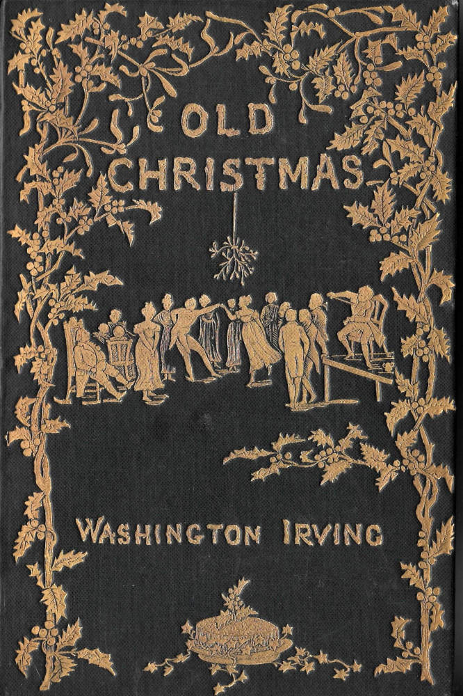

Caldecott also created bindings that were issued in the more traditional idiom of cloth with gilt overlays. Before he began his working partnership with Evans, he designed two fine covers for Macmillan (Muir,165; Engen, 13): Old Christmas (1875) by Washington Irving, and its sequel, Bracebridge Hall (1876). The first of these is a ‘striking’ (Muir, 165) design of holly and mistletoe, notable for its vital decorative frieze; the second, by contrast, depicts an austere figure and a decorative shrub in the simplified manner of Art Nouveau. Both are visually linked to artist’s illustrations, and here, as in his later work, Caldecott articulates the harmonious unities that are so characteristic of books of the final quarter of the nineteenth century, and so lacking in the periods before.
Kate Greenaway’s Bindings
Unlike Caldecott, whose toy-books were revolutionary in their use of a paper cover, Greenaway’s publications reverted to the model provided by Crane, with colour designs being printed on a laminated or cloth board. In some of her books for Evans the front cover reproduces the pictorial frontispiece, though it is more typically the case that Greenaway embellished the binding with an original design.


Foremost among these are her liveries for Under the Window (1877–8) and The Language of Flowers (1882). On both covers Greenaway establishes the Regency imagery contained in the illustrations, presenting elegant figures in the costumes of the early nineteenth century. Under the Window is a typical example of this approach, framing the title in a concentric frieze, a procession of children seen as they approach (on the left hand border) and depart, turning their backs to us, on the right; inviting the reader to intervene or participate in their endless movement, the characters are linked as they turn, break into a run, or hold up flowers. The effect is lyrical and appealing, encouraging the reader/viewer to read on, to move, with the children, into the scenes contained within the covers.


This light-heartedness, often described by contemporaries as joyousness, is found in all of Greenway’s front covers, which are as sentimental and self-consciously beautiful, with their bright colours and intricate costumes, as her illustrations.
Greenaway and Caldecott might thus be described as important contributors to the development of late Victorian bindings. By breaking down the division of outer and inner, they unified their books' design and established an unbreakable link between the imagery of the binding and the pages that follow.
Books with Covers Designed by Caldecott
The Farmer’s Boy. London: Routledge [1881].
The Great Panjandrum Himself. London: Routledge [1885].
Hey Diddle Diddle and Baby Bunting. London: Warne [1882].
Irving, Washington. Bracebridge Hall. London: Macmillan, 1876.
Irving, Washington. Old Christmas. London: Macmillan, 1875.
Ride a-Cock Horse to Banbury Cross. London: Routledge [1884].
Books with Covers Designed by Kate Greenaway
The Language of Flowers.London: Routledge, 1884.
Under the Window. London: Routledge, 1877–8.
Secondary Material
Engen, Rodney.Randolph Caldecott, Lord of the Nursery.London: Bloomsbury, 1976.
Muir, Percy. "Victorian Illustrated Books. London: Batsford, rev. ed., 1985.
Last modified 21 February 2018