Introduction: developments in Victorian bindings

ook bindings of the nineteenth century were highly diverse, and subject to the vagaries of changing fashions. Usually issued in cloth, they came in a wide range of colours and styles; some were embossed with decorative gilt devices, others were purely functional. A plain livery was used for ‘serious’ literature, but books intended as gifts were unashamedly ostentatious Set up to impress the recipient, they were designed to create as great an impact as possible.
Gift books of the sixties were typically bound in coloured cloth, with gilt patterns on the boards and spine and gilt edges; sometimes intended as presentation pieces or published in time for Christmas, they were part of and helped to shape domestic rituals. Conceived as signs of giving, objects to be purchased and presented, they were enmeshed in the commercial systems of the time. Not so much literature as popular art, they were positioned as consumables, objects which asserted their identity as wares in the market-place, and as such their physical design had two functions: to please the recipient, and to persuade the purchaser to buy the book in the first place. They had to appeal in the aesthetic sense of the term, and they had to be effective pieces of marketing.


Advertisements for gift books in the London-based Reader (1864). Click on images to enlarge them.
Ways of manipulating the consumer’s vision was a motivating force in the presentation of new books, and the competition for buyers was both the primary concern of both publisher and designer. How to attract an audience using attractive bindings was a complicated matter, which led to the development of ever more impressive ways to catch the reader’s eye. This was true for Christmas gift books, souvenirs and other light-weight publications for leisure reading. Strategies involved the use of new and unusual materials, illusionism which gave an impression of glamour and expense, visual referencing and other gimmickry. All such publications might thus be described as novelties – objects to be judged (or at least procured) on the basis of their material form. The approach produced many curiosities, and the end result was sometimes incongruous.
Gift books of the Sixties: from cloth to tortoiseshell
ift books of the middle part of the period were elaborated versions of the Keepsakes and Annuals of the thirties and forties, but their attempt to beguile the consumers’ eye was far more pronounced — and far more excessive — than the models from which they were derived. The steel-plate etchings that illustrated the earlier gift books were replaced with large and impressive engravings on wood, a vehicle for some of the greatest artists of the time; and the bindings became excessively showy. Designers such as John Leighton, Robert Dudley, A.H. Warren and John Sliegh provided intricate patterns in gilt, and the cloth boards were issued in a variety of colours. The sheer resplendence of these designs creates a kaleidoscopic effect: the front cover of Sliegh’s Odes and Sonnets (1867) is embellished with gilt that makes it looks more like the lid of a Renaissance jewellery box than the outer surface of a book, while Leighton’s A Round of Days (1866) is a curious confection of styles which mediates between the conventions of Gothic and the decorative devices of Islamic pattern-making. Illusionism and eclecticism are deployed to create a memorable effect. As in Victorian architecture, the viewer is endlessly engaged and surprised by the free intermingling of styles, and it is significant that several of the book designers – notably Owen Jones, Sliegh and Dudley – were also architectural draughtsmen.
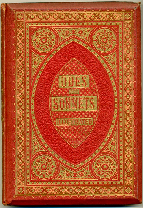

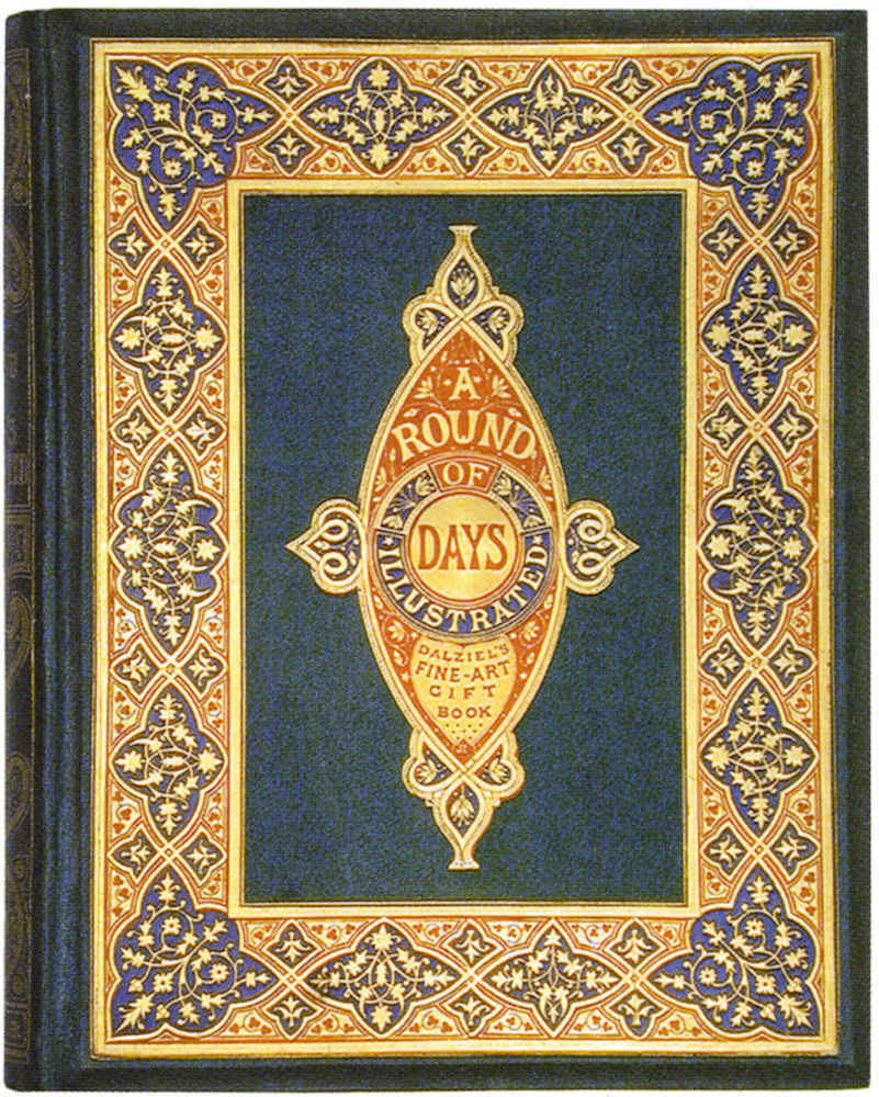
Left: John Sleigh's binding for Odes and Sonnets. Middle and right' Two versions of John Leighton's binding for A Round of Days. [Click on images to enlarge them.]
Yet with all of this inventiveness the basic formula of the gift book – gilt patterns and brightly-coloured cloth – had a limited shelf-life. Novelty quickly exhausts itself and as in all capitalist production and consumption the new had to re-new itself as it struggled to compete for buyers in a market which by the mid-sixties was saturated with hundreds of publications of the same sort. To win successive generations of buyers, publishers had to make their products ever more appealing: change became a virtue in itself, with decoration ever more elaborate, eventually declining into a mannerism in which effects are overstated. This movement is suggested by comparing Leighton’s binding for Old English Ballads (1864) with the anonymous casing for Robert Buchanan’s North Coast (1868). The first, while elaborate, is elegant and well-proportioned; the second, a piece of faux Celticism in which the surface combines gilt and polychromatic panels to create an overloaded and garish effect. If gift books of the sixties were inherently vulgar, many of them degenerate into what many contemporaries regarded as showy trash, and we might describe as kitsch.
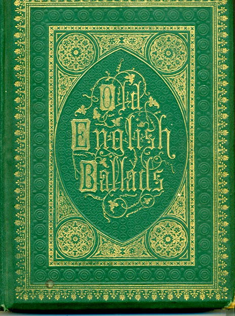
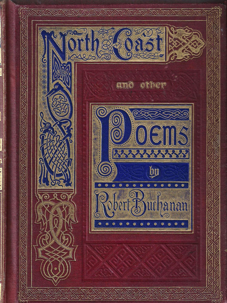
Left: John Leighton's binding for Old English Ballads. Right: North Coast and Other Poems, binding by an unknown designer. [Click on images to enlarge them.]
This inevitable decline was noted by the publishers and as the period unfolded constant attempts were made to expand the gift books’ conventions. One approach was the deployment of figurative scenes in the form of chromolithographic panels which were pasted onto the front cover. Though featuring as early as 1864, as in Warren’s Summer Time in the Country, by the end of the period many books were embellished with this device. The anonymous front cover for Thomson’s Poems (1869) is a good example, combining a framing device in gilt with a central image of a pastoral scene printed in several colours. Also noticeable is the fashion for gimmicks. Two Centuries of Song (1869), a binding by Harry Rogers, has a brass clasp to hold its boards together – an entirely unnecessary addition which solemnly references a particularly light-weight book to incunabula; others were bound in unfamiliar and exotic materials.


Left: W.H. Rogers's binding for Two Centuries of Song. Right: Binding by an unknown design for Thomson's Poems. [Click on images to enlarge them.]
Notable attempts were made to stress the luxuriousness of gift books by presenting them in what was apparently wood or tortoiseshell. Owen Jones had experimented with wooden bindings in the forties, but by the sixties there were many imitations created for a large reading public rather than an elite. Of course, the cost of these books ensured that the material was not real: instead of wood, papier mâché was used. Made up in large pliable sheets, the mâché was compressed, stuck onto rigid card, bevelled using a metal frame, coloured with a dark stain, patterned and varnished, most typically producing an effect of polished mahogany which was finished off with an impressed gilt pattern. As was usual with gift books generally, production was a mixture of man and machine, with the dark colours applied by hand but the rest of it passing through an industrial process. Good examples are Golden Leaves (1865) and The Book of Gems (1868); both have an impressive sturdiness, with a furniture-like hardness to the boards, but they are, nevertheless, purely ephemeral pieces, the product of illusionism.


Two examples of bindings made in imitation malachite . [Click on images to enlarge them.]
The same sort of trompe d’oeil was applied to the production of fake malachite. Often mistaken for precious, bespoke objects, they too are the embodiment of industrial techniques. Rarities today, these books exemplify the publishers’ attempts to refresh their products, no matter how strange (and fundamentally dishonest) those products might be.
From Yellowbacks to Mauchline ware: travelling and tourism
he development of the railways in the forties and fifties facilitated the development of internal tourism, with middle-class travellers from England taking holidays in Yorkshire and the North, the North-East, Cornwall and the West, Wales and Scotland. The longer journeys involved in travelling from the Home Counties to the further reaches of Britain encouraged a fundamental change in the understanding of British culture while also leading to the development of a range of products which set out to entertain the traveller.
One such product was these was the ‘Yellow-back’ — a cheap work, usually of fiction and usually a reprint, made up of low grade paper bound in yellow glazed boards with an image on the front cover; developed by the engraver Edmund Evans at the beginning of the fifties – who printed his early designs on yellow paper – the genre provided the traveller with something to read. Purchased from a kiosk at the railway station (W. H. Smith the stationers having set up in 1848), as the journey began, they were cheap enough (sometimes as little as sixpence) to leave behind once the traveller disembarked. Usually embellished on the front cover with a lurid illustration, these editions were produced in huge numbers until the 1890s; many were enhanced with images by outstanding artists – notably George Du Maurier, who designed the cover of M. E. Braddon’s Lady Audley’s Secret– and all set out to stimulate the eye. We can imagine that yellow-backs entertained many hours of travelling between the capital and Inverness or from Kent to Cornwall, and many have survived. Part of the ritual of passage, along with bottles of lemonade and sweet-meats purchased by street-vendors on the platform, yellow-backs were dispensable entertainment, the gaudy detritus of mid-Victorian consumerism.
Once the vacationer had arrived there were other books to entertain the time. A vast range of souvenir books were published. Most were bound in purely functional cloth or paper bindings, but others set out to emulate the precious effects of the gift-book. These more expensive books incorporated distinctive emblems of the town or area, such as a coat of arms or a local scene.


Left: A Card binding for Disraeli's Henrietta Temple. Right: A Mauchline-ware binding of Scott's The Lay of the Last Minstrel. [Click on images to enlarge them.]
The most sustained attempt at producing quality souvenirs was developed by the company of W. A. Smith, which was set up in the small Scottish town of Mauchline, Ayreshire, in the 1820s, and continued until 1933, when the factory was destroyed in a fire. Smith produced a range of treen objects that extended from pin-boxes and egg-timers to towel-rings and wooden bindings for books of poetry, fiction and landscape views. These imprints were offered as Scottish memorabilia; though Smith issued work as an independent company, most books were published in conjunction with Blackie, Ross and other publishers based in Edinburgh.
However, Mauchline’s selling point was its distinctive production: bound in wooden boards with a leather, goat-skin or cloth spine and embellished on the covers with a photographic transfer print of a local scene, the books were intended to be viewed as primitive, quaint, or at least evocative of a culture different from England’s. Souvenirs often function as signs of otherness which remind the purchasers of the novelty of being in a place away from home, and the images on Mauchline bindings exaggerate the signifiers of Scotland. Thistles, harps, tartan patterns (known as Tartanware), ferns (Fernware), and romantic ruins predominate. Containing Scottish texts or texts about Scotland, they frame their material in nostalgic (and almost entirely synthetic) imagery. The books offer a generic notion of faux Celticism while reanimating memories of the area and its associations. Playing on the town’s association with Scott and Robbie Burns, who had lived locally, Mauchline books make the strongest link with holiday destinations in the Lowlands and Borders.
Mauchline productions represent the higher quality end of the souvenir-market. The boards are made of sycamore coated with varnish, the spines are generally good quality morocco and the pages are sewn rather than glued. The overall effect is one of robustness. A good example is a copy of Scott’s The Lay of the Last Minstrel, which was published by John Ross in Edinburgh in 1872. This has all the virtues of Mauchline book: the convex boards are embellished with scenes from Melrose Abbey, the tips are unchipped after almost 150 years, and the spine is carefully crafted in black morocco with a title and Scottish emblems. In contrast to most gift books of the period, these self-parading works outlasted the function for which they were originally intended.
Glazed boards and children’s books of the eighties and nineties

nother strand in the development of popular publishing is the use of glazed pictorial boards. This type of binding becomes a characteristic feature of children’s books of the seventies, eighties and nineties; based on the yellow-back technology of printing images on glossy paper, it creates a cheerful and imposing result. It also had the advantage of being cheap and easy to produce, a matter of printing in colour the illustrations contained within the book and pasting them on to the front and rear boards, and in some cases the cover design was an original work. Costs were minimised by binding the spine in cloth, although the finished artefact, designed to withstand the travails of the nursery, was surprisingly strong. The shiny surface of the cover ensured that spillages could be cleaned off – a development which accommodates the unsteady hand of the juvenile reader.
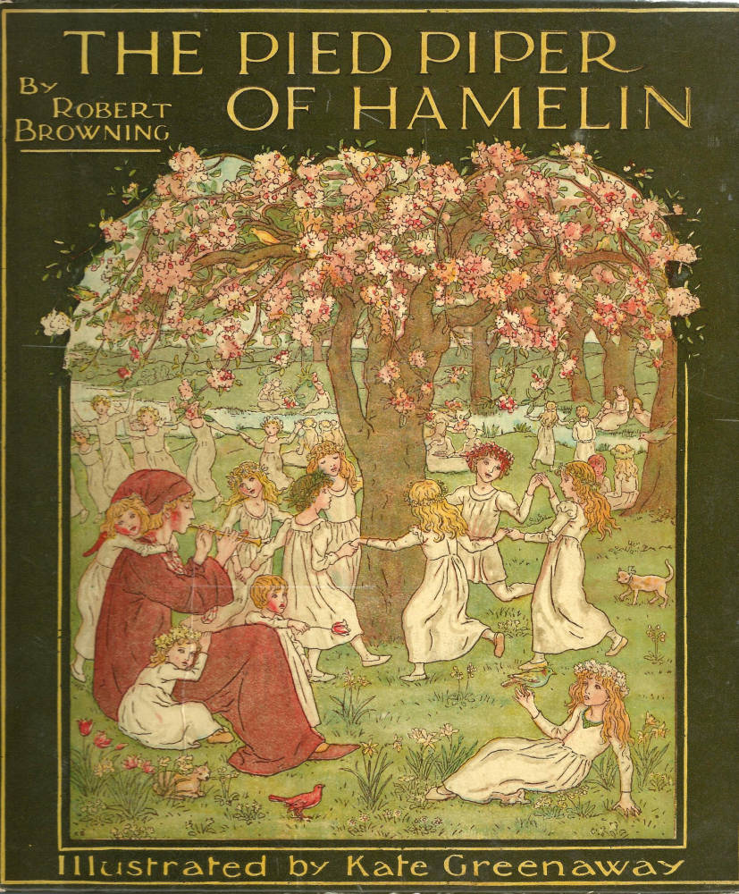


Left three: Paper bindings for works by Kate Greenaway. Right: Harrison Weir's cover for his own Animal Stories. [Click on images to enlarge them.]
Almost all of the outstanding children’s illustrators presented books in this style and many were printed in colour by Edmund Evans. Evans originated this binding style and his glazed boards are the most imposing, so creating a logical development from the bindings used in the presentation of yellow-backs. Harrison Weir’s Animal Stories [1886] and Robert Barnes’s front cover for Sydney Grey’s Story Land [1885] are prime examples. However, Evans’s most distinguished work was reserved for his collaborations with Kate Greenaway and Walter Crane. In the late seventies and eighties Edmund supervised the engraving and binding of a delightful series of children’s books by these artists, each of them bound in colourful boards. Crane’s Pan Pipes and The Baby Opera are high quality productions and so are Greenaway’s Under the Window and The Pied Piper of Hamelin. Published by George Routledge and re-issued by Warne, these are among the most pleasing books of the age.
Works cited and consulted
Book of Gems, The. Wordsworth to Tennyson. Tortoiseshell binding by an unknown designer. London: Bell & Daldy, 1868.
Browning, Robert. The Pied Piper of Hamelin. Illustrated in colour and with a colour paper binding by Kate Greenaway. Engraved by Edmund Evans. London: Frederick Warne [1885].
Buchanan, Robert. North Coast and Other Poems. An elaborate binding by an unknown designer. London: Routledge, 1868.
Crane, Walter. The Baby's Opera. Illustrated in colour and with a colour paper binding by Walter Crane. Engraved by Edmund Evans. London: Routledge [1877].
Crane, Walter. Pan Pipes.Illustrated in colour and with a colour paper binding by Walter Crane. Engraved by Edmund Evans. London: Routledge [1882].
Golden Leaves … Chaucer to Cowper. Tortoiseshell binding by an unknown designer. London: Griffin, 1865.
Greenaway, Kate. The Language of Flowers. Illustrated in colour and with a colour paper bindings by Greenaway. Engraved by Edmund Evans. London: George Routledge, 1884.
Greenaway, Kate. Under the Window. Illustrated in colour and with a colour paper binding by Greenaway. Engraved by Edmund Evans. London: George Routledge, 1878.
Grey, Sydney. Story Land. Illustrated in colour and with a colour paper binding by Robert Barnes. London: RTS [1886].
Maclean, Ruari. Victorian Book Design and Colour Printing. London: Faber & Faber, 1963.
Odes and Sonnets.London: Routledge, 1863; first published in another form in 1859. Cover, spines and coloured decorations by Sliegh; engraved by the Dalziels.
Old English Ballads. Binding designed by Leighton. London: Ward & Lock, 1864.
Round of Days Described in Original Poems, A London: George Routledge and Sons, 1866. Binding designed by Leighton.
Scott, Walter. The Lay of the Last Minstrel. Bound in a Mauchline-ware wooden binding with a two transfer prints of Melrose Abbey on the front and rear. Edinburgh: John Ross, 1872.
Summer Time in the Country. Edited by Robert Aris Willmott. Cover (probably) designed by Warren. London: Routledge, 1864.
Thomson's Poems. Elaborate chromolithographic inlaid binding by an unknown designer. Edinburgh: Nimmo, 1869.
Two Centuries of Song. Edited by Walter Thornbury. Cover designed by Rogers. London: Sampson Low, 1867.
Weir, Harrison. Animal Stories Old and New. Illustrated in colour and with a colour paper binding by Weir. London: Sampson Low [1886].
Created 13 October 2015
Last modified 19 October 2015