The graphic art of the mid-Victorian period is remarkable in its avoidance of sexual themes. Published in books and magazines for a middle-class audience which was bound by the moral and social codes of the time, the illustrations rarely suggest the erotic desire that lies beyond the confines of romance. In a vast myriad of images there is barely a kiss or sexualized exchange, and it was not until the Decadence of the nineties that erotic themes were explored by artists such as Aubrey Beardsley and Charles Ricketts. Within this chaste and respectable context only Sandys presents challenging images which extend and subvert the discourse of polite behaviour.


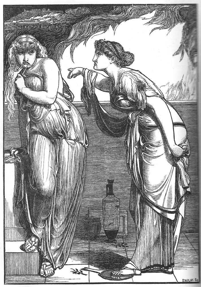
Left to right: (a) Cleopatra. (b) Danaë in the Brazen Chamber. (c) Helen and Cassandra [Click on these images for larger pictures.]
His approach is generally one in which sexual behaviour was presented in a lightly-coded form. Sandys cleverly reveals the latent eroticism of mid-Victorian Arcadia. It is well known that neo-classical painters validated what are sometimes pornographic images by presenting them as types of classical taste, showing nudity when it is really nakedness, and Sandys playfully experiments with this idea. Mild eroticism features in Cleopatra, an image Goldman describes as ‘splendidly voluptuous’ (p.51). Cleopatra herself is a shapely figure, but the image’s sexual content is more obviously expressed in the semi-naked women, who feature, with breasts exposed, in the background. This is an interesting piece of coding in which the artist suggests an erotic atmosphere through a process of racial displacement: the black attendants are shown semi-naked, while it would never be acceptable to depict a white woman in these terms. What we would describe as racism is here merely a device to suggest the main character’s sexuality, projecting it onto her minions; the literate viewer would understand the meaning of the device as a surrogate for a white woman’s eroticism, while others would read it simply as an ornamental background (with the figures treated like hieroglyphics) that would offend nobody within the viewing audiences of imperial Britain. A parallel obliqueness features in the other neo-classical designs, especially in Helen and Cassandra, which uses draperies to both conceal and suggest the heroines’ voluptuous bodies.
Far more direct, however, is Danaë in the Brazen Chamber. This shows the character brushing her hair in a way which is practically pornographic in its representation of a woman whose ecstatic upturned face and stance explicitly suggest sexual arousal in the manner of Rossetti’s subject in Beata Beatrix (1860–64, Tate Britain, London). The artist’s calculation was probably that he could present his character as a femme fatale or Desirable Woman of the type that regularly featured in neo-classical painting, and safely displaced into some imagined mythological space. On this occasion, however, he seems to have gone too far: the publisher William Bradbury would not accept it within the respectable pages of Once a Week, and it was not published until 1888, when it appeared in The Century Guild Hobby Horse. Bradbury supposedly turned it down because it shows a tiny representation of male genitals, but it is likelier that he needed to have an uncomplicated excuse to decline what was essentially unacceptable within the taste of the time.

Amor Mundi
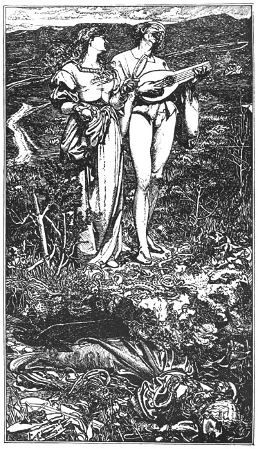
Sandys is on firmer ground in Amor Mundi,an illustration in the rare Shilling Magazine for a poem by Christina Rossetti. In this design Sandys visualizes the destructiveness of sexual love by juxtaposing the healthy bodies of the lovers with a representation of the future in the form of the woman’s corpse, literally placed beneath their feet. Goldman has noted how the image ‘reflects strongly the sickly odour of death’ (p.52), and the artist reinforces the message, as Lorraine Kooistra explains, by including emblematic details:
In a final comment on love of the world, Sandys shows [the woman’s] blackened lips brushing against a mirror on which she has fallen; a rat appears ready to remove the rotting fruit clutched in her decomposing hand. In the far left, the broken lute mounted by two toads is an iconographic reminder of the destruction of the body’s sensuous pleasures as well as a symbol of the lover’s own inevitable death [p.111].
Sandys thus presents both alluring sexuality and its destructiveness. In both cases he adopts an iconoclastic pose, challenging expectations while working within the traditions of neo-classical aesthetics and the emblem-book traditions of Dürer and the German wood-cut.
Last modified 15 July 2013