Good Fight, the first version of The Cloister and the Hearth, was published in the opening issues of Once a Week from July to October, 1859. Keene provided fifteen illustrations, in each case creating a visual response that was based on proof or hand-written instalments. These were sent to him on a weekly basis, with just a few days to draw his design directly on to the wood, send it to the engraver Joseph Swain to engrave and create a proof, wait for the proof to be returned, suggest any revisions, and return it to the engraver to cut, create an electrotype and arrange the printing. This process echoed the travails of Phiz, who had to produce two etchings for each monthly instalment of Dickens’s novels, though Keene, working on a weekly schedule, had an even tighter deadline and must always have felt pressured. His visualization of Reade’s novel is nevertheless well-conceived and consistent within its own terms.
His editor’s insistence on the need to ‘translate’ and be faithful to the writer’s intentions are clearly embodied in his ‘apt’ or literal mirroring of textual specifications. The illustration to episode six (1: 1859, p.110) epitomises this approach. The text describes a scene involving a broken arrow and ends with Margaret carrying the ‘pointed knife’ as she darts ‘out of the room’ and these details are preserved in the engraving; we read the letterpress and read the same details in visual form. His materialisation of the main characters is likewise a matter of re-presenting the writer’s portraiture and with few additions of his own is a close replication of Reade’s directions, showing how the characters might look if they were flesh and blood.
These strategies allowed the artist to provide a pictorial response that was at least a competent piece of illustration – a buttressing of Reade’s effects through a process of repetition and reinforcement. Functioning as a visual amanuensis, he conforms to Lucas’s prescriptive and traditional view of how the illustrative text should work; however, he is far more expansive in his foregrounding of what he views as the key elements.
Keene’s interpretation focuses on the novel’s historical milieu. Reade provides some scant information; we are told in the opening lines that:
It was past the middle of the fifteen century, Louis XI. was sovereign of France; Edward IV. was wrongful King of England; and Philip “the Good” having by force dispossessed his cousin Jaqueline, and broken her heart, reigned undisturbed this many years in Holland, where our tale begins. [p.11]
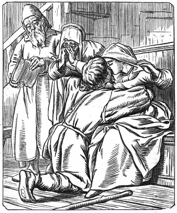
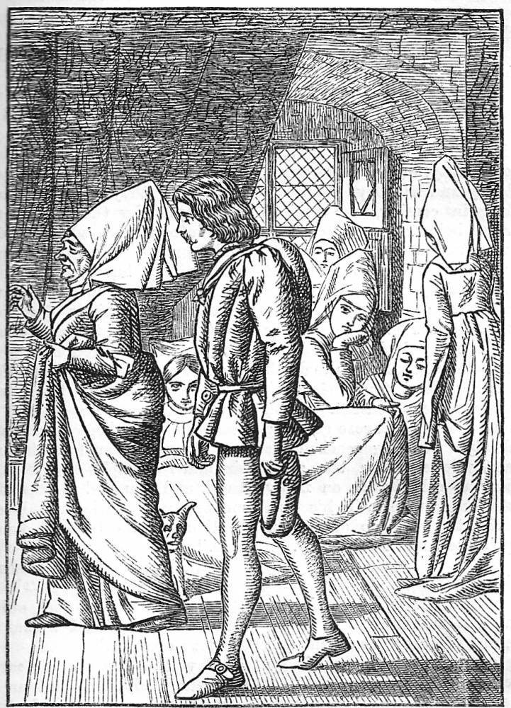
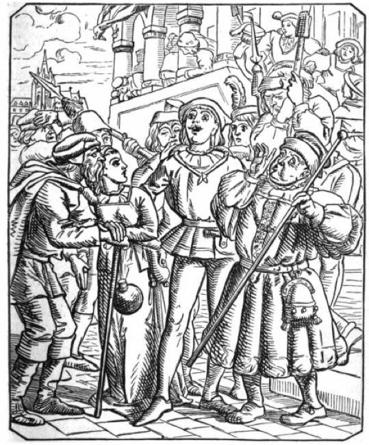
The text otherwise contains details of costume and setting, and these are reproduced in the illustrations. However, Keene develops the fiction’s evocation of its historical milieu through a process of visual allusion. Reade evokes some generalized sense of bygone Flanders by using archaic lexis and diction in the manner of many historical novels of the period (‘Alas’, ‘tis’, ‘fie’, and similar), but Keene re-figures the writing by using a style that recalls the late medieval woodcuts of the sort found in German incunabula (Cooke, Illustrated Periodicals, p.112). He is reported to have studied examples of sixteenth century books in The British Library, and although it is not known which publications he consulted, his illustrations emulate the spare line of wood-cut artists of the Nuremberg School. This is the style, in other words, in which the characters would have been represented by artists of their own time. Reade’s archaisms are decorative additions within an otherwise modern telling, while Keene takes the reader/viewer into what is at least a version of the ‘look’ of the period, a world immerses the spectator in its visual texture. This reference is a clever translation of Reade’s cod treatment of the past, and Keene develops this inter-pictorial approach in other aspects of his designs. The crowded compositions and calculated gaucherie of many of the designs adds to the sense of plausible antiquarianism, and most powerful are those alluding to religious art of the time of van Eyck (who is a character in the book) and the Northern Renaissance. This is especially noticeable in the final design depicting the reconciliation of the main characters, who are racked by suffering in the manner of figures appearing in The Piéta or The Descent from the Cross (Once a Week, 1, p.273).


Three of Keene's illustrations for Reade's novel — left to right: (a) Clement flung himself wildly on his knees. (b) At the sight of a stranger. (c) He found the Hooch Street, and it speedily led him to the Stadthouse [Click on these images for larger pictures.]
This historical approach, connecting the novel to its period, is one strand in Keene’s interpretation. The other involves a focus on movement. Reade’s terse writing is animated by rapid dialogue, exclamations, hurried movements and transitions, and Keene privileges these scenes while diminishing moments of stillness and reflection. In so doing he foregrounds the idea of the novel as an adventure story, encapsulating the most dynamic scenes – though not necessarily the scenes of greatest significance – in a series of dramatic tableaux. The characters are always shown in animated poses: the embrace of Gerard and Margaret (1, p.131), the escape through the woods (1, p.191) and Giles’s escape down the rope (1, p.151) are good examples. Keene focuses on intimate gestures, confrontations and especially looking outward to an event that we cannot see, so suggesting an event that is yet to come and will be discovered as we read the text. The effect is to infuse the action with an ever greater dynamism, figuring the book as a montage of dense, agitated designs with the characters pushed together or propelled forward to some future event.
Keene rushes the reader/viewer, and the novel is only encountered as a hurried experience. The illustration of Margaret’s escape, looking back at the reader as she scurries away, is emblematic of the way in which Keene roots the fiction in an historical past but impatiently directs us towards the end (1, p.191). In so doing he greatly contributes to the novel’s breathless effect, a fortuitous move given the public’s response was not a charitable one and one which demanded rapid consumption. Reade’s fiction was not appreciated and declining sales meant that Lucas directed him to conclude it as soon as possible, bringing it to an ignominious (and ludicrous) end, with whole chapters reduced to a few paragraphs, in October of 1859. A disgruntled Reade thought his text had been successful and was unwilling to accept that the ‘paltry illustrations’ had done ‘the business’ (qtd. Pantazzi, p. 44). However, it is likely that Keene’s designs were the main attraction, and helped the novel to achieve at least a limited popularity; the illustrations were heavily promoted in advertisements appearing in Notes and Queries, The Art Journal and The Saturday Review, and were generally admired as bold and experimental work. It is telling, of course, that Reade’s tale was subsequently re-worked in the form of The Cloister and the Hearth, which improves significantly on its first version. But the illustrations were never republished in full, and it quite likely that Reade ensured they never again competed with his (revised) text.
Works cited and sources of information
Cooke, Simon. Illustrated Periodicals of the 1860s: Contexts and Collaborations. Pinner: PLA; London: The British Library; Newcastle, Delaware: Oak Knoll Press, 2010.
Brothers Dalziel, The. A Record of Work, 1840–1890. 1901; new ed. London: Batsford, 1978.
Goldman, Paul. Victorian Illustration: the Pre-Raphaelites, the Idyllic School and the High Victorians. Aldershot: Scolar, 1996; new ed. London: Lund Humphries, 2004.
Hammerton, J.A. George Meredith: His Life and Art. London: Grant, 1911.
Houfe, Simon. The Work of Charles Samuel Keene. Aldershot: Scolar, 1995.
Layard, G. S. The Life and Letters of Charles Samuel Keene. London: Sampson Low, Marston & Co., 1892.
Muir, Percy. Victorian Illustration. London: Batsford, 1971.
Pantazzi, Sybille. ‘Author and Illustrator: Images in Confrontation’. Victorian Periodicals Newsletter 9:2 (June 1976): 39–49.
Pennell, Joseph. Pen Drawing and Pen Draughtsmen. London: Macmillan, 1897.
Ray, Gordon. The Illustrator and the Book in England from 1790 to 1914. New York: Pierpont Morgan Library, 1976.
Reade, Charles. ‘A Good Fight’. Once a Week 1 (July–December 1859).
Reade, Charles. ‘Foul Play.’ Once a Week (January–June 1868).
Reade, Charles. ‘Put Yourself in His Place’. The Cornhill Magazine, 1869 –70.
Reade, Charles. The Cloister and the Hearth. London: Chatto & Windus [1882].
Reid, Forrest. Illustrators of the Eighteen Sixties. 1928; rpt. New York: Dover, 1975.
White, Gleeson. English Illustration: The Sixties, 1855 –70. London: Constable, 1897.
Last modified 8 May 2014